Creating a Gallery in Flash Using the Moto CMS Component
by 10 August, 2011 4:13 pm0
In this tutorial we will create a gallery with the help of the Moto CMS Component.
I think many of you have heard about (or even worked with) Moto Flash CMS – an advanced content management system for Flash. The CMS is considered as today’s most feature-rich system for Flash that allows us to develop Flash websites with no limits in animation and effects, without getting into any coding.
The system is used by developers as a standalone version or together with a Flash template (that is actually a complete website that can be edited even by a user with no programming skills).
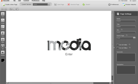
Results of Moto CMS Component:
Today I would like to show you what can be done with the help of the Moto CMS component. So, for creating a Flash photo gallery we will use two abstract classes.
Final Result:

1. FLA file settings For Moto CMS Gallery
Let’s start by opening Flash and creating a new FLA file. We’ll name it thumbnailsModule.fla in this tutorial. It should be put in the same folder where the “src” folder is placed. Now we’ll open the Publish Settings (Ctrl+Shift+F12), open the ActionScript settings, and set the classpath “./src”:

2. Creating the ThumbnailsModule Symbol CMS Photo Gallery
Open the Components window (Ctrl+F7) and drag the Moto CMS Component, the Moto CMS Image Loader, and Photo Gallery Thumbnails components to the library.

Drag the Photo Gallery Thumbnails component to the stage, give it the instance name “preview”, and press F8 to convert it to Symbol. Let’s name it ThumbnailsModule; use the same name for the Class name, and set the Base class: modules.photoGalleryModules.ThumbnailsModule
This class is not created yet, so we should create it before clicking OK. Let’s go to srcmodulesphotoGalleryModules and create ThumbnailsModule.as. We’ll add the script later.
Now let’s get back to the FLA, click OK, and select the created Movie Clip on the stage. We set its instance name to thumbnailsModule.

Open the ThumbnailsModule Movie Clip. Let’s create a Shape object on a new layer with the Rectangle tool (R), set Alpha = 0% in its color settings, and convert it to Symbol. Let’s name it contentHolder and give it the same instance name on the stage. Then we convert it to Symbol again. We name it galleryHolder, and use the same instance name as well.

As you can see, we have two layers in our ThumbnailsModule Movie Clip – one for preview, and the other for galleryHolder. The galleryHolder has the contentHolder inside.
3. Creating navigation controls with Moto CMS
Open the galleryHolder Movie Clip and insert a new layer. Let’s use the Pencil tool (Y) to draw an arrow on this layer. Then we can use the Transform Tool (Q) to rotate it the way we need to.

As we draw the white arrow in this example, we change the Backgrond Color of the flash document to grey.
Let’s convert this arrow to Symbol. The name and the Class name will be ThumbnailsNavigationBtn, and the Base class will be: modules.photoGalleryModules.ThumbnailsNavigationBtn
Let’s also set the Registration in the center.

We should create ThumbnailsNavigationBtn.as in srcmodulesphotoGalleryModules before clicking OK. We’ll leave the class empty for now.
Then we open the ThumbnailsNavigationBtn Movie Clip and convert the arrow to Symbol again. Let’s name it “clip”, and give its instance the same name. The Registration should be set in the center.

We should convert this Movie Clip to Symbol once again. This time it will be named “icon”. Registration: center. So now we have two Movie Clips inside the ThumbnailsNavigationBtn – “icon” and “clip”. We have created this structure to easily handle the button properties with the help of the script.
We should also create a Movie Clip which would be a hit area for the button. We open the ThumbnailsNavigationBtn Movie Clip, insert a new layer, and put it under the icon layer. Then we draw a Shaped object of the arrow’s dimensions, make it transparent, and convert it to Symbol. Let’s name it “back”. The instance name should be “back” as well.

Then we open this Movie Clip and convert the Shape object to Symbol again. This Movie Clip will be named backIcon. The instance name should be “icon”.

Now we’ll get back to the galleryHolder Movie Clip, select the ThumbnailsNavigationBtn on the stage, and convert it to Symbol. It will be the controlsHolder Movie Clip with the same instance name. We should also place it in zero coordinates inside Moto CMS.

Let’s open it, insert a new layer, and add one more instance of the ThumbnailsNavigationBtn Movie Clip to the stage. Again, in Moto CMS, lets’ move it to the right and select Modify – Transform – Flip Horizontal. It will be the next button. Let’s give the buttons instance names prevBtn and nextBtn, respectively.

So, we have created the thumbnails controls.
4. Creating the Moto CMS item class
Now we should create the thumbnail class (item renderer), which will be used by the script for every new thumbnail. Let’s get back to the main timeline of the FLA document and drag the Moto CMS Image Loader component to the stage. Let’s give it the instance name “image”. We should also open the Parameters tab and set the Scaling Mode: fill.

Then we convert it to Symbol and name it imageHolder. Don’t forget to set the Move Clip Registration to the top left corner, as it was by default.

Now we convert it to Symbol again. It will be the item renderer class, so we’ll check the “Export for ActionScript” box, and specify the class names:

We set Base class: modules.photoGalleryModules.ThumbnailItemRenderer
This class is not created yet, so we go to srcmodulesphotoGalleryModules and create an empty ThumbnailItemRenderer.as.
Now we can open the ThumbnailItemRenderer Movie Clip and animate the imageHolder. We should set the frame labels to “show”, “over”, and “out”. You can make any animation you like. In this example we make it appear from transparency (Alpha = 0% in the first keyframe), and increase its brightness on mouse over (Advanced color in the third keyframe, and 140% to every color channel).

We put the “stop();” code over each keyframe. There should also be the condition over the second keyframe, so that the selected thumbnail looks moused overe right after appearing:

Let’s also create the preloader. We insert a new layer, and create a Movie Clip with an instance name “preloader”. You can create any preloading animation insde this Movie Clip.

The item renderer is ready.
5. Creating the thumbnail cover with Moto CMS
Now we should create one more class, which will be something like a cover for the item renderer. Our thumbnails will have the border and the rounded corners set by the code, so it will be better to work with the cover.
Let’s get to to the main timeline and create a Movie Clip inside moto cms with a transparent shaped object. It’s instance name should be contentHolder (do not confuse with the contentHolder Movie Clip we have created before). Then we convert it to Symbol once again. We export it for ActionScript and specify the class names:

Base class: modules.photoGalleryModules.ThumbnailItemRendererCover
Same as before, we should go to srcmodulesphotoGalleryModules and create an empty ThumbnailItemRendererCover.as.
Now we can open the ThumbnailItemRendererCover Movie Clip and create the animation. We should use the same frame labels as we used for the ThumbnailItemRenderer: “show”, “over”, and “out”. In this example we only create the animation of appearing from transparency. You may also create the animation of mouse over and mouse out, if needed.

We have created all the needed elements in Flash. We should go to the main timeline and remove ThumbnailItemRenderer and ThumbnailItemRendererCover Movie Clips from the stage. They will be taken from the library via the linkage name. The only Movie Clip that has to be left on the stage is ThumbnailsModule.
6. Creating the CMS Photo Gallery ThumbnailsModule class
Now it’s time to create the script. The srcmodulesphotoGalleryModules path contains 6 AS files at the moment – 2 abstract classes, which will not be modified by us, and 4 empty classes. Let’s start from the main class – ThumbnailsModule.as. We add the class constructor with the main imports:
package modules.photoGalleryModules
{
	import com.moto.template.common.Moto;
	import com.moto.template.common.events.ExternalDataProviderEvent;
	import com.moto.template.common.view.IInteractiveItemRenderer;

	public class ThumbnailsModule extends AbstractGalleryThumbnailsModule
	{

		public function ThumbnailsModule()
		{
			super();

		}

	}
}
Then we create the necessary variables:
package modules.photoGalleryModules
{
	import com.moto.template.common.Moto;
	import com.moto.template.common.events.ExternalDataProviderEvent;
	import com.moto.template.common.view.IInteractiveItemRenderer;

	public class ThumbnailsModule extends AbstractGalleryThumbnailsModule
	{
		private var _controlsHolder:MovieClip;
		private var _nextBtn:ThumbnailsNavigationBtn;
		private var _prevBtn:ThumbnailsNavigationBtn;
		private var _propertyNavigationBtnWidth:Number = 0;

		public function ThumbnailsModule()
		{
			super();

		}

	}
}
Let’s also add MovieClip to imports: import flash.display.MovieClip;
Then we should assign the variables to the created elements, and specify the next/previous buttons:
package modules.photoGalleryModules
{
	import com.moto.template.common.Moto;
	import com.moto.template.common.events.ExternalDataProviderEvent;
	import com.moto.template.common.view.IInteractiveItemRenderer;

	public class ThumbnailsModule extends AbstractGalleryThumbnailsModule
	{
		private var _controlsHolder:MovieClip;
		private var _nextBtn:ThumbnailsNavigationBtn;
		private var _prevBtn:ThumbnailsNavigationBtn;
		private var _propertyNavigationBtnWidth:Number = 0;

		public function ThumbnailsModule()
		{
			super();

			_controlsHolder = _galleryHolder["controlsHolder"];
			_nextBtn = _controlsHolder["nextBtn"];
			_prevBtn = _controlsHolder["prevBtn"];

			thumbnailsPaginator.nextButton = _nextBtn;
			thumbnailsPaginator.previousButton = _prevBtn;
		}

	}
}
Now we override the updateProperty method. This method will handle the properties set in the xml file. Each case number matches the property ID in the XML file.
		override public function updateProperty(propertyVO:PropertyVO):void
		{
			super.updateProperty(propertyVO);
			switch (propertyVO.propertyType)
			{
				case 8:
					_nextBtn.updateProperty(propertyVO);
					_prevBtn.updateProperty(propertyVO);
				break;

				case 18:
				case 19:
				case 20:
					_nextBtn.updateProperty(propertyVO);
					_prevBtn.updateProperty(propertyVO);
				break;
			}
		}
We should also add PropertyVO to imports:
import com.moto.template.shell.model.vo.PropertyVO;
Then we override the protected method switchPaginatorHandler. We check whether there is the next/previous page and disable the appropriate button if not. Also we check to see if the thumbnail is clicked now. If it is not, the script switches pages.
		override protected function switchPaginatorHandler(event:Event = null):void
		{
			if (thumbnailsPaginator.hasNextPage())
			{
				_nextBtn.alpha = 1;
				_nextBtn.mouseEnabled = true;
			}
			else
			{
				_nextBtn.alpha = .5;
				_nextBtn.mouseEnabled = false;
			}

			if (thumbnailsPaginator.hasPreviousPage())
			{
				_prevBtn.alpha = 1;
				_prevBtn.mouseEnabled = true;
			}
			else
			{
				_prevBtn.alpha = .5;
				_prevBtn.mouseEnabled = false;
			}

			if (thumbnailsArranger.rememberSelectedItem)
			{
				thumbnailsArranger.selectItemRendererByIndex(currentIndex, false);
				if(thumbnailsArranger.selectedItemRenderer){
					ThumbnailItemRendererCover(thumbnailsArranger.selectedItemRenderer).showOverState();
				}
			}
		}
Let’s also import Event:
import flash.events.Event;
The next method which we are going to override is setSize. This method contains the logic of resizing and positioning.
		override public function setSize(newWidth:Number, newHeight:Number):void
		{
			super.setSize(newWidth, newHeight);

			newWidth = int(newWidth);
			newHeight = int(newHeight);

			if (initialized)
			{
				_nextBtn.setSize(newHeight, _propertyNavigationBtnWidth);
				_prevBtn.setSize(newHeight, _propertyNavigationBtnWidth);

				_nextBtn.x = _contentHolder.width;
				_controlsHolder.y = newHeight/2;
				_controlsHolder.rotation = 0;
				_contentHolder.x = 0;
				_contentHolder.y = 0;
			}
		}
We should add OrientationEnum to imports:
import com.moto.template.common.view.OrientationEnum;
Finally we override the show and hide methods to add tweens.
		override public function show():void
		{
			super.show();
			this.mouseChildren = true;
			Tweener.addTween(this, { alpha:1, time:.5 } );

		}

		override public function hide():void
		{
			super.hide();
			this.mouseChildren = false;
			Tweener.addTween(this, { alpha:0, time:.5} );
		}
We add the Tweener class to imports:
import caurina.transitions.Tweener;
7. Creating the ThumbnailItemRenderer class
When the ThumbnailsModule class is ready, we can switch over to ThumbnailItemRenderer.as. The class constructor will be:
package modules.photoGalleryModules
{

	public class ThumbnailItemRenderer extends AbstractThumbnailItemRenderer
	{

		public function ThumbnailItemRenderer()
		{
			super();

		}

	}
}
Then we create variables for image and preloader and import the needed classes.
package modules.photoGalleryModules
{
	import com.moto.template.common.view.components.loaders.ImageLoader;
	import flash.display.MovieClip;

	public class ThumbnailItemRenderer extends AbstractThumbnailItemRenderer
	{
		private var _image:ImageLoader;
		private var _preloader:MovieClip;

		public function ThumbnailItemRenderer()
		{
			super();

		}

	}
}
Now we assign the variables to the elements in the class constructor.
package modules.photoGalleryModules
{
	import com.moto.template.common.view.components.loaders.ImageLoader;
	import flash.display.MovieClip;

	public class ThumbnailItemRenderer extends AbstractThumbnailItemRenderer
	{
		private var _image:ImageLoader;
		private var _preloader:MovieClip;

		public function ThumbnailItemRenderer()
		{
			super();

			_image = imageHolder["image"];
			_preloader = this["preloader"];

			_preloader.alpha = 0;
		}

	}
}
Then we override the updateRenderer method. We specify the image path and add listeners for successful complete and error events.
These classes should be added to imports:
import com.moto.template.common.events.MediaLoaderErrorEvent;
import flash.events.Event;
		override public function updateRenderer(data:Object):void
		{
			super.updateRenderer(data);

			_image.source = pathPrefix + dataVO.getPropertyValueByID(2);
			_image.addEventListener(Event.COMPLETE, imageCompleteHandler);
			_image.addEventListener(MediaLoaderErrorEvent.ERROR, imageCompleteHandler);

			Tweener.addTween(_preloader, {alpha:1 , delay:0.5, time:1});
		}
The events will be handled by the imageCompleteHandler method, which we need to create now. In case of succesful complete we hide the preloader and play the showing animation.
		private function imageCompleteHandler(event:Event):void {
			switch(event.type) {
				case Event.COMPLETE:
					Tweener.addTween(_preloader, { alpha:0, time:1 } );
					show();
					gotoAndPlay(showLabel);
				break;

				case MediaLoaderErrorEvent.ERROR:
					Tweener.addTween(_preloader, { alpha:0, time:1 } );
				break;
			}

		}
Let’s also import the Tweener class:
import caurina.transitions.Tweener;
The next step will be overriding the setSize method and adding the resizing logic.
		override public function setSize(newWidth:Number, newHeight:Number):void
		{
			newWidth = newWidth || getDimensions().width;
			newHeight = newHeight || getDimensions().height;

			_image.setSize(newWidth, newHeight);
			_image.drawNow();

			_preloader.x = (newWidth - _preloader.width) / 2;
			_preloader.y = (newHeight - _preloader.height) / 2;
		}
The getDimensions method passes the actual size of the element. So, we override it and return a rectangle of image dimensions.
		override public function getDimensions():Rectangle
		{
			return new Rectangle(0, 0, _image.width, _image.height);
		}
Rectangle should be added to imports:
import flash.geom.Rectangle;
8. Creating the ThumbnailItemRendererCover class
Right after the ThumbnailItemRenderer class we are going to write a script for its “cover” – ThumbnailItemRendererCover.as. Let’s start with adding the basic code:
package modules.photoGalleryModules
{
	import com.moto.template.modules.gallery.GalleryThumbnailCover;
	import flash.display.MovieClip;

	public class ThumbnailItemRendererCover extends GalleryThumbnailCover
	{

		public function ThumbnailItemRendererCover()
		{
			super();

		}

	}
}
We add a new variable, which will be used in the script. Then we create a new Sprite object in the base class and add a content holder. This way we implement the thumbnail covering. We also enable buttonMode, disable mouseChildren, and add an event listener.
package modules.photoGalleryModules
{
	import com.moto.template.modules.gallery.GalleryThumbnailCover;
	import flash.display.MovieClip;

	public class ThumbnailItemRendererCover extends GalleryThumbnailCover
	{
		private var _borderThicknessOnOver:uint;

		public function ThumbnailItemRendererCover()
		{
			super(new Sprite());

			Sprite(this["contentHolder"]).addChild(_contentHolder);

			buttonMode = true;
			mouseChildren = false;

			addEventListener(Event.ADDED_TO_STAGE, addedToStageHandler)
		}

	}
}
Let’s also add Sprite and Event classes to imports:
import flash.display.Sprite;
import flash.events.Event;
Now we should create a function which will be fired when the thumbnail cover is added to stage. It should remove the event listener and play the showing animation.
		private function addedToStageHandler(event:Event):void
		{
			removeEventListener(Event.ADDED_TO_STAGE, addedToStageHandler);

			show();
			gotoAndPlay(showLabel);
		}
Then we override the updateProperty method. It will handle the thumbnail properties related to the border shaping. This way we apply them to the cover, not to the thumbnail itself.
		override public function updateProperty(propertyVO:PropertyVO):void
		{
			super.updateProperty(propertyVO);
			var thisDimensions:Rectangle = getDimensions();
			switch (propertyVO.propertyType)
			{
				case 6:
					_roundRadius = uint(propertyVO.value) * 2;

					setSize(thisDimensions.width, thisDimensions.height);
				break;

				case 7:
					_borderThicknessOnOver = uint(propertyVO.value);
					_strokeThickness = 0;
					setSize(thisDimensions.width, thisDimensions.height);
				break;

				case 8:
					_strokeColor = uint(propertyVO.value);

					setSize(thisDimensions.width, thisDimensions.height);
				break;

				case 9:
					_strokeAlpha = uint(propertyVO.value) / 100;

					setSize(thisDimensions.width, thisDimensions.height);
				break;
			}
		}
We also add PropertyVO and Rectangle to imports:
import com.moto.template.shell.model.vo.PropertyVO;
import flash.geom.Rectangle;
Then we add getter and setter for the stroke thickness property.
		public function get strokeThickness():uint {
			return _strokeThickness;
		}

		public function set strokeThickness(value:uint):void {
			_strokeThickness = value;
		}
We should also create the showOverState method, which will be called to play the mouseover animation when a new thumbnail is selected by the prev/next button.
		public function showOverState():void {
			over();
		}
Then we override over and out methods and add tweens for mouseover and mouseout animation.
		override protected function over():void
		{
			super.over();

			Tweener.addTween(this, {strokeThickness:_borderThicknessOnOver, time:0.3, rounded:true, onUpdate:setSize, onUpdateParams:[0, 0]} );
		}

		override protected function out():void
		{
			super.out();

			Tweener.addTween(this, {strokeThickness:0, time:0.6, onUpdate:setSize, onUpdateParams:[0, 0]} );
		}
Let’s also import the Tweener class:
import caurina.transitions.Tweener;
The ThumbnailItemRendererCover class is ready.
9. Creating the ThumbnailsNavigationBtn class
Now we proceed to the only class left – ThumbnailsNavigationBtn. Let’s add the basic code.
package modules.photoGalleryModules
{
	import common.AbstractNavigationBtn;

	public class ThumbnailsNavigationBtn extends AbstractNavigationBtn
	{

		public function ThumbnailsNavigationBtn()
		{
			super();

		}

	}
}
Then we create new variables which will be used in the script.
package modules.photoGalleryModules
{
	import common.AbstractNavigationBtn;
	import flash.display.MovieClip;

	public class ThumbnailsNavigationBtn extends AbstractNavigationBtn
	{
		private var _backShape:MovieClip;
		private var _iconShape:MovieClip;

		private var _propertyBackColor:uint = 0x000000;
		private var _propertyBackAlpha:Number = .15;

		private var _propertyIconColor:uint = 0xFFFFFF;
		private var _propertyActiveIconColor:uint;
		private var _propertyIconAlpha:Number = .15;

		private var _propertyRoundRadius:uint = 0;

		public function ThumbnailsNavigationBtn()
		{
			super();

		}

	}
}
In the class constructor we stop the playback on the first frame, set buttonMode and mouseChildren, specify hitArea, assign variables to the elements, and initialize ColorShortcuts.
package modules.photoGalleryModules
{
	import caurina.transitions.properties.ColorShortcuts;
	import common.AbstractNavigationBtn;
	import flash.display.MovieClip;

	public class ThumbnailsNavigationBtn extends AbstractNavigationBtn
	{
		private var _backShape:MovieClip;
		private var _iconShape:MovieClip;

		private var _propertyBackColor:uint = 0x000000;
		private var _propertyBackAlpha:Number = .15;

		private var _propertyIconColor:uint = 0xFFFFFF;
		private var _propertyActiveIconColor:uint;
		private var _propertyIconAlpha:Number = .15;

		private var _propertyRoundRadius:uint = 0;

		public function ThumbnailsNavigationBtn()
		{
			super();

			gotoAndStop(1);

			buttonMode = true;
			mouseChildren = false;
			hitArea = back;

			_backShape = back["clip"];
			_iconShape = icon["clip"];

			ColorShortcuts.init();

		}

	}
}
Then we override the updateProperty method and handle the buttons’ properties, such as color and transparency level.
		override public function updateProperty(propertyVO:PropertyVO):void
		{
			super.updateProperty(propertyVO);
			switch (propertyVO.propertyType)
			{
				case 18:
					_propertyActiveIconColor = uint(propertyVO.value);
				break;

				case 19:
					_propertyIconColor = uint(propertyVO.value);

					MotoUtils.setColor(_iconShape, _propertyIconColor, _propertyIconAlpha);
				break;

				case 20:
					_propertyIconAlpha = uint(propertyVO.value) / 100;

					MotoUtils.setColor(_iconShape, _propertyIconColor, _propertyIconAlpha);
				break;
			}
		}
Finally we override over and out methods. We add tweens and set them to colour the buttons on mouseover and mouseout.
		override public function over():void
		{
			super.over();
			Tweener.addTween(this, {_color:_propertyActiveIconColor, time:1} );
		}

		override public function out():void
		{
			super.out();
			Tweener.addTween(this, {_color:_propertyIconColor, time:1} );
		}
So we have created all the needed classes.
10. Initializing the module
If we added this gallery to Moto template, it would be initialized automatically. We want to initialize it outside the template, so we need to add special code. Let’s go to the main timeline of the FLA file and insert a new layer. Then we select the first frame and press F9. We should insert this code:
import org.puremvc.as3.multicore.patterns.facade.Facade;
import com.moto.template.shell.model.vo.*;
import com.moto.template.shell.model.*;
import com.moto.template.common.*;

var _propertiesXML:XML = new XML(
	'' +
		'' + // Widget Connection ID. This property is needed only when the module is loaded in the Moto template.
		'' + // Prevent Second Click
		'' + // Image to Start From
		'' + // Item Creation Delay
		'' + // Item Corner Radius
		'' + // Item Border Width
		'' + // Item Border Color
		'' + // Item Border Alpha
		'' + // Item Width
		'' + // Vertical Spacing
		'' + // Rows
		'' + // Active Arrows Color
		'' + // Base Arrows Color
		'' + // Arrows Alpha
	''
);

var _facade:Facade = new Facade("TEST");
_facade.registerProxy(new WebsiteProxy(this));
var _motoProxy:MotoProxy = new MotoProxy();
_facade.registerProxy(_motoProxy);
var _templateMoto:TemplateMoto = new TemplateMoto(_motoProxy);
Moto.setInstance(_templateMoto);

initializeModule(
	thumbnailsModule,
	[],
	'' +
		'gallery.xml' +
		'ThumbnailItemRenderer' +
		'ThumbnailItemRendererCover' +
	'',
	true
);

function initializeModule(module:MovieClip, propertiesValues:Array = null, data:String = "",
	resizable:Boolean = true):void
{
	// Module type
	var moduleTypeVO:ModuleTypeVO = new ModuleTypeVO();
	moduleTypeVO.resizable = resizable;

	// Slot
	var moduleVO:ModuleVO = new ModuleVO();
	moduleVO.moduleType = moduleTypeVO;

	moduleVO.width= 937;
	moduleVO.height = 671;
	moduleVO.x = 62;
	moduleVO.y = 0;

	// Properties
	moduleVO.properties = propertiesParser(_propertiesXML);

	// data
	moduleVO.data = data;

	// Init slot
	module.init(moduleVO);
}

function propertiesParser(xml:XML):Array
{
	var objectProperties:Array = [];
	for each (var property:XML in xml.elements())
	{
		var propertyType:uint = uint(property.@propertyType);
		if (propertyType)
		{
			var propertyVO:PropertyVO = new PropertyVO();
			propertyVO.propertyType = propertyType;
			propertyVO.value = String(property);

			// Get parameters
			propertyVO.parameters = new Object();
			for each (var parameter:XML in property.attributes())
			{
				var key:String = parameter.name().toString();
				var value:String = parameter.valueOf().toString();
				propertyVO.parameters[key] = value;
			}

			objectProperties.push(propertyVO);
		}
	}
	return objectProperties;
}
There is a set of properties in _propertiesXML. These properties are handled by updateProperty methods, which we have created in AS files. Lines 36-38 contain the XML file name and the thumbnail’s and its cover’s library linkage names. Lines 54-57 contain the module’s width, height, and coordinates. You can adjust these values to your needs.
Let’s open the Flash Document Properties and set the dimensions. These values depend on the thumbnails gallery size. In this example we set 1040 x 671.

11. Creating the Moto CMS gallery XML file.
The script from the previous step contains reference to the gallery.xml file. We can put it to the same directory where our SWF file is placed, or create somea folder and add a path prefix to the gallery.xml file location. Here is the XML file content:
<?xml version="1.0" encoding="utf-8"?>
<simpleGalleryModule>
 <configuration>
 <option id="previewPropertyID">
 <value>1</value>
 </option>
 <option id="thumbnailPropertyID">
 <value>2</value>
 </option>
 <option id="thumbnailWidth">
 <value>299</value>
 </option>
 <option id="thumbnailHeight">
 <value>217</value>
 </option>
 <option id="maxRootItems">
 <value>0</value>
 </option>
 </configuration>
 <structure>
 <properties>
 <property id="1" type="media">
 <name><![CDATA[Preview]]></name>
 <parameters>
 <image>true</image>
 <flash>true</flash>
 <video>true</video>
 </parameters>
 </property>
 <property id="2" type="image">
 <name><![CDATA[Thumbnail]]></name>
 </property>
 <property id="3" type="link">
 <name><![CDATA[Link]]></name>
 </property>
 </properties>
 <template>
 <properties>
 <item propertyType="1"/>
 <item propertyType="2"/>
 <item propertyType="3"/>
 </properties>
 </template>
 </structure>
 <data>
 <item id="1" order="1"><properties><item propertyType="1"><![CDATA[images/image1_big.jpg]]></item><item propertyType="2"><![CDATA[images/image1_small.jpg]]></item><item propertyType="3"><![CDATA[]]></item></properties></item>
 <item id="2" order="2"><properties><item propertyType="1"><![CDATA[images/image2_big.jpg]]></item><item propertyType="2"><![CDATA[images/image2_small.jpg]]></item><item propertyType="3"><![CDATA[]]></item></properties></item>
 <item id="3" order="3"><properties><item propertyType="1"><![CDATA[images/image3_big.jpg]]></item><item propertyType="2"><![CDATA[images/image3_small.jpg]]></item><item propertyType="3"><![CDATA[]]></item></properties></item>
 </data>
</simpleGalleryModule>
The gallery elements should be put in the tag. Three items are already added as an example. Every an item has three properties, properties with id 1 and 2 are the preview and the thumbnail images paths. The third property can be used for specifying a link. You can just duplicate the existing “item” node to add as many elements as you need. Please note that every new item must have the unique “id” and “order” attributes.
This post on Moto CMS was brought to you by Paul Flores. He currently works with the Moto CMS components and develops Flash websites on the basis of Moto CMS and Moto Flash templates.
Thank you for reading the Moto CMS tutorial! I hope you liked it. Your comments will be highly appreciated.
Related posts

Announcements & News / by - 15 February, 2016 4:36 am
ICANN to Allow .What-everrrr Domain Registrations
The Internet Corporation for Assigned Names and Numbers (ICANN) has changed a rule that will allow the reservation of existing domain names that use any combination of letters and numbers….

Latest / by - 4 February, 2016 1:04 pm
Some of the more popular alternatives to point of sale checkout
Decades ago we were all used to queueing at the traditional point of sales (POS). The high street cash register was king when it came to paying for purchases, in…

iPhone / by - 19 January, 2016 2:47 pm
How much protection do you get from an iPhone screen protector?
Many people argue that it’s no longer necessary to protect your iPhone with a screen protector due to the higher quality of glass used in construction. If you have seen…
Tech News / by - 4 December, 2015 4:30 am
Why Would I Need a GoPro?
While modern smartphone cameras have moved far beyond their basic beginnings to become comparable alternatives to dedicated camera equipment for amateur photographers, the GoPro’s range of advanced features make it…

Tech News / by - 11 September, 2015 6:20 am
Here’s Why You Should Buy a Tablet This Year
The iPad was introduced in the spring of 2010. That was the beginning of the modern tablet era. In fact, 2011 was the year of the iPad/tablet. From that point,…

Tech News / by - 18 June, 2015 11:06 am
Smart Decisions to Secure Your Apple Device
Millions of customers use iPhones, Macbooks and other Apple devices. The growing use of Apple products has led to hundreds of security threats to these devices. Malware and viruses can…

Tech News / by - 5 March, 2015 4:42 am
How Economic Networks Are Replacing Economies of Scale in The Knowledge Economy
In the book, Information Rules, authors Carl Shapiro and Hal R. Varian make an astonishing statement: “There is a central difference between the old and new economies: the old industrial…

Tech News / by - 9 December, 2014 6:59 am
Samsung Galaxy Products: A Cut Above The Rest
Samsung is the market leader in terms of smartphone sales. Samsung galaxy products are ahead of its class and are known for its innovative features and affordable price. The company’s…
Tech News / by - 20 November, 2014 8:29 am
Japan’s Domestic Companies Loss is International Online Casino Industries Gain
Japan remains one of the largest, if not the largest, untapped gambling markets in the world, in regards to both the online and offline sectors for domestic companies. This dominating…

Tech News / by - 7 November, 2014 5:57 am
Five Reasons to Use Your Smartphone as a Credit Card Reader
Years ago, the term “credit card reader” was not used very loosely. Either you had a machine that allowed you to take an imprint of a customer’s credit card or…

Tech News / by - 9 July, 2014 9:35 am
More Creative Ways to Sell Your Products Online
Selling goods on the Internet is both easy and difficult. It’s easy because there are many available resources that make setting up online shops quick and easy. They can also…
Tech News / by - 9 July, 2014 9:25 am
Getting the Right Video Conferencing Equipment for an Effective Team Collaboration
Any time you need to get on a video conference call, you might worry about whether the person on the other end can see and hear you properly. If you’re…

Tech News / by - 23 May, 2014 6:09 am
Fighting Internet Lag – 4 Strong Tips For Reducing Connection Latency
Internet drag, or “latency” is a dreaded occurrence to all equally. It sucks to have to wait for buffering, or to have your immersive video gaming experience so rudely interrupted…

Tech News / by - 5 August, 2013 7:28 am
When Tech Goes Wrong – The Biggest Tech Outages of 2013
Most of the time, we expect search engines, social networks and other forms of web technology to be up and running – but recent events have shown that even big…

Tech News / by - 20 July, 2013 2:26 pm
New Apps You Must Know About
Combining Apps with IFTTT iPhone’s new automation app ‘If This Then That’(IFTTT) allows you to bring two separate apps together by mentioning which of them is the “This” one and…

Tech News / by - 18 July, 2013 2:58 pm
Five Tablet Apps To Dispel Your Doodle Dilemmas
For all those who lament over the neglect that technology has showered on the art of doodling till date – good news has arrived. In a space cluttered with inefficient…

Tech News / by - 16 July, 2013 1:35 pm
Is your Android Device Safe?
The Android OS is Google’s open source operating platform for smart phone and tablet devices. Android is currently the second most popular platform in terms of number of users. This…
Tech News / by - 13 July, 2013 3:07 pm
Apple’s App Store – Now and Then
The world of personal computing went for a spin on 10th July 2008 with the launch of Apple’s App Store, presenting its users with an unfathomable ocean of apps that…

Tech News / by - 10 July, 2013 3:24 pm
Dodge The Disaster: A Five-Step Guide To Technology-Based Disaster Preparation
Disasters are unpredictable and unpreventable. Being prepared to face the inevitable, whenever it strikes, is definitely judicious. In the modern-day world of incredible breakthroughs in every field, technology has progressed…

Tech News / by - 7 July, 2013 12:04 pm
Google’s Offline Disk Import: Just the Thing Developers Wished For
If you are worried about importing very large sets of data on Google Cloud Storage, then Google has come up with just the right solution. Google has recently added a…


